
 Continue with onX Maps
 Sign in with Facebook


New Data Visualization Tool For Your Ticklist!
|
|
Heyo fellow climbers I'm stoked to introduce a free new tool that can allow you to better understand your Mountain Project Ticklist data. Get Data Visualizations on:
Here's some of my favorite charts: 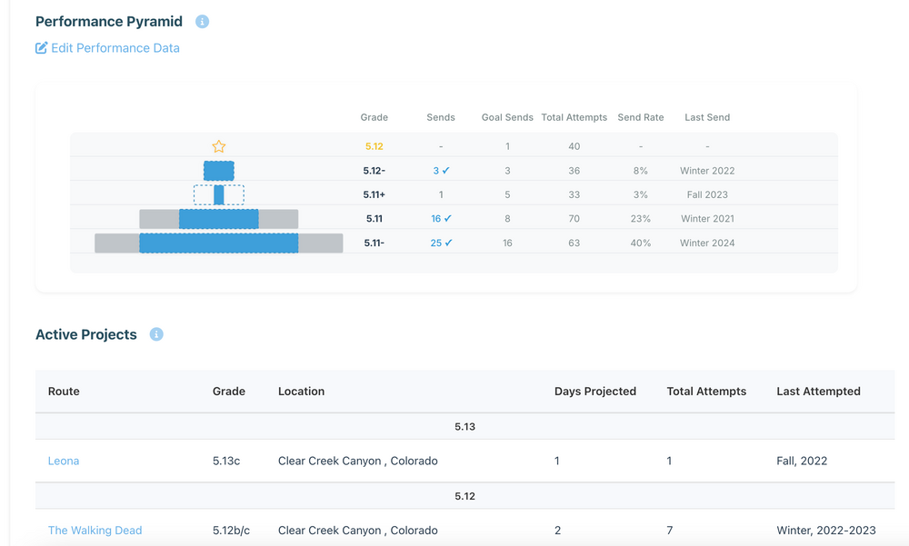 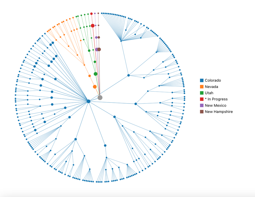 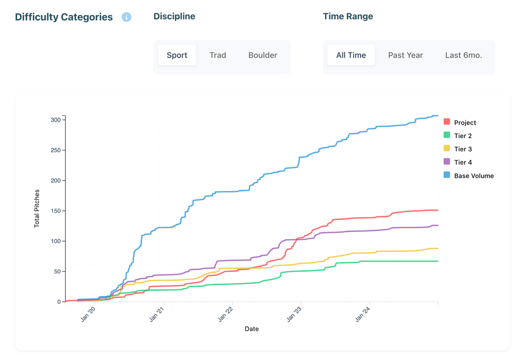 Link to the website: ----------------- Note on Development: I built this analysis tool solo as a passion project to give back to the community that has given me so much, a big thank you to all *and a special thanks to the fellow climbers who helped me debug and test over on the Training Forum. Currently, the app can process tick lists with up to 2100 entries due to server constraints. If there's enough interest and support from the community, I'd be thrilled to upgrade the server's capabilities so all climbers can benefit. Also due to these server constraints, during times of high volume traffic there could be errors due to too many concurrent users, so if you're encountering errors, please try again another time. If you'd like to contribute to solving these issues or would like to support me, feel free to buy me a coffee. ----------------- I would love to hear your feedback or see your favorite visualizations! Give it a try, share with your friends, and share your thoughts. *there's always an info button near the viz title if you would like to know how the data was calculated. Happy climbing! |
|
|
Wow, over 150 of you have checked out the application! |

|
Isaac Rubey wrote: Ummm...it didn't work for me. I made my ticklist public and it still didn't pull any thing. |
|
|
 Woah! Watching this graph build as a function of time is pretty cool. "ohh yeah I used to climb there all the time" and then an area that used to be top of your list slowly gets pushed further and further down. |
|
|
Branon Rochelle wrote: Hey Brandon, I looked at your profile, it appears you don't have any ticks recorded yet on your account, I wonder if there was a problem with making the ticks public? |
|
|
Isaac Rubey wrote: I put it back to private when it didn't seem to make any difference. I gave it another shot and it did pull some data, but the name doesn't match, there are ticks from states I haven't visited in over a decade and climbs I haven't done. ¯\_(ツ)_/¯ Edit: working right now. Thank you |
|
|
The site won't show me my data and only shows the data of Branon Rochelle |
|
|
onX should hire you to develop for them. Beautiful interface! Thanks for sharing |
|
|
Thanks for the feedback, I made some updates that will fix the concurrency problem, you won't be seeing other's data when your browsing your visualizations, even if there are others using the app at the same time. Wanted to drop my favorite visualization so far, check this out!  This climber has an incredible dedication. Their lifetime vertical climbed is approaching the altitude of the International Space Station! Respect
|
|
|
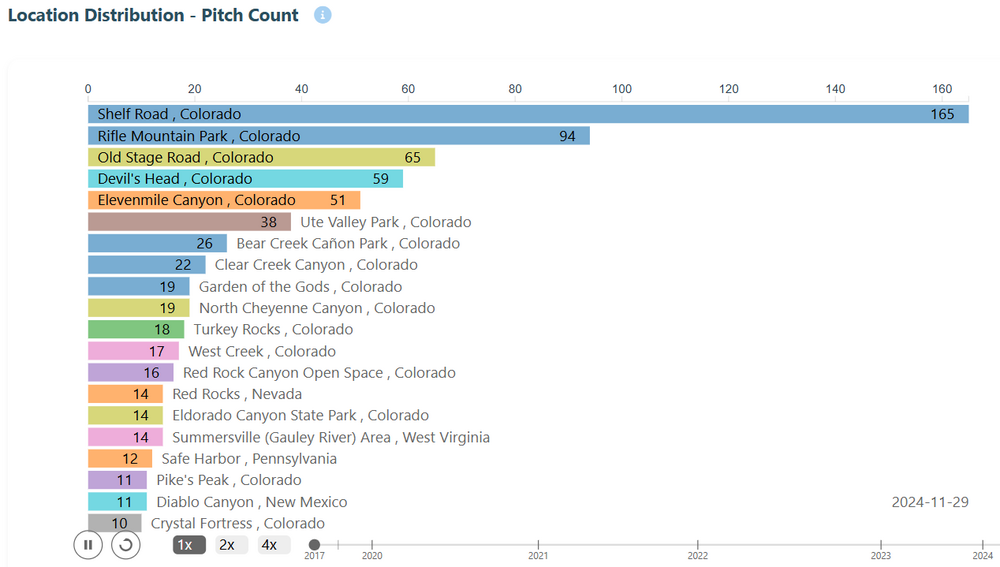
Awesome tool, the location distribution animation is sick! It looks like the performance metrics ignore any routes with more than one type though (like "Sport, TR" or "Trad, Sport") |
|
|
Very cool. Seems like there might be something funny going on with the way it's counting boulder sends. My pyramid shows me sending several problems that I've only ever ticked as "Attempt" |
|
|
Super cool! The Location Tree is beautiful. Really, the entire Climbing Location Analysis page is a work of art. Love the animation for pitch count. I've been working on a lil climbing data app myself. Really great to see some cool ones released recently. Amazing work man, so clean! |
|
|
Carson Sloan wrote: Thanks for the feedback Carson and Chris, I updated the app to classify climbs more accurately, try refreshing your data on the homepage of the app and you can see if that improves your data. |

|
Nice! A few points of feedback: - The performance pyramid dates have a bug, the "last send" date has no relationship I can see to the data in "performance data" and thus isn't correct - One suggestion for performance visualization would be visualizing max redpoint/second try send/flash/onsight over time |
|
|
Great work Isaac! Any chance of having a seperate dataset analysis for ice and mixed? It current appears under sport and trad within the tool for me. |
|
|
Nice work! I similarly found MP's built-in stats to be a bit lacking and made my own analysis via a Google Sheet that pulls from MP's tick feed. I really wanted to see my progression as a new climber from top-roping and following into leading at various grades. I like your line-graphs and one possible control you could add would be to include all climbs or filter to just leads or just not-leads. I like your concept of tiers and am interested to explore how that factors into my climbing journey, though I certainly climb a lot harder on TR than leading, so I'd see tiers to be bucketed by style.Living in snow-country I also like bucketing my seasons by calendar year rather than just the previous 12 months as I usually have a clear dividing line and the winter and enjoy seeing how each season stacks up to the last one as I go through it. 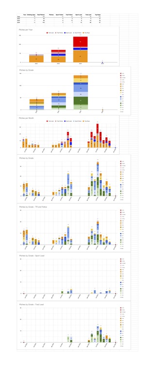 |
|
|
Josh S wrote: Thanks for the feedback, just updated the performance data and pyramid viz to
refresh your data on the home page and check it out! |
|
|
Hey everyone—building on the amazing feedback from over 500 climbers who tried my analytics prototype, I'm stoked to announce it has officially evolved into SendSage, a fully functional platform now live at send-sage.com. It automatically syncs with your Mountain Project or 8a.nu logbook to unlock powerful features like interactive performance pyramids, visual exploration of your climbing history, smart project tracking, and even an experimental AI companion for personalized insights. As I'm now developing SendSage full-time, you can sign up today and support its rapid, ongoing improvement for about the price of a monthly coffee. |


