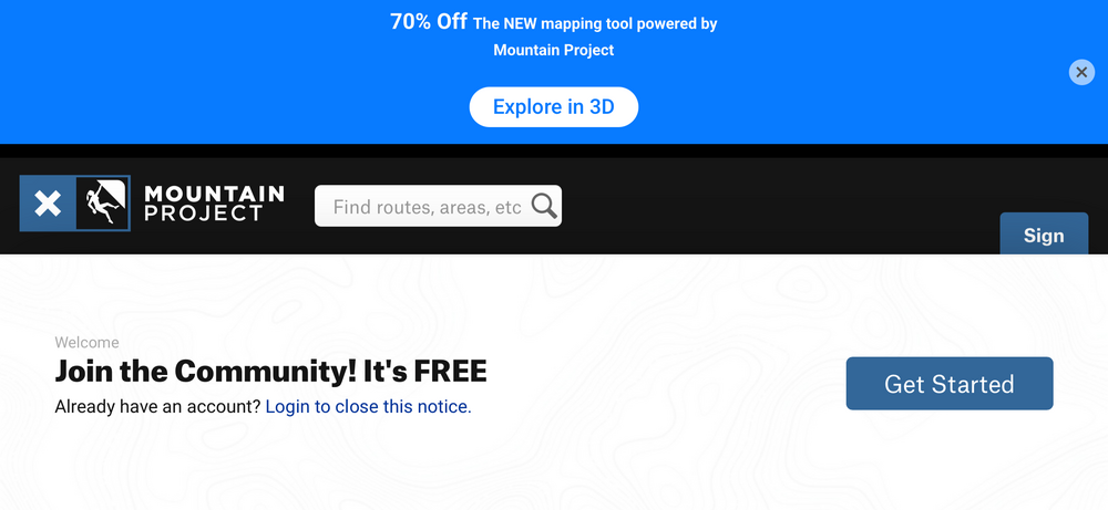
Here is the current user experience if someone is sent a mountain project link without previously being logged in:
1. Click on link, web browser opens 2. Web page briefly loads with about 30% of the page covered by a bottom sheet "Join the Community" CTA. 3. The page is then 100% covered by a top sheet "Get the App" CTA. 4. The top sheet is then covered about 15% by "New Mapping Tool 70% off" CTA. This CTA covers the close button of the previous one. 5. User dismisses the 3rd CTA. Modal goes away 6. User dismisses the 2nd CTA. Modal goes away 7. User dismisses the 1st CTA. Modal does NOT go away. 8. Finally, I can view 80% of the page now (any part of the page covered on mobile can be a real issue, especially in landscape: see attached photo) 9. Click to expand comments or view more photos, prompted again to log in. Unable to view these comments or photos until I log in.
It goes without say, this is an absolutely terrible experience. Please stop placing these CTAs all over the app and stacking them together. A small prompt at the bottom suggesting I log in is great. Making it non-dismissible and locking features behind it is lame.


 Continue with onX Maps
 Sign in with Facebook