
 Continue with onX Maps
 Continue with Facebook


Route and Area page redesign - preview and give feedback!


|
In our process of rebuilding MP from the ground up, we're getting ready to release new Area and Route pages. It's the same content but it's on our new codebase which has a lot of benefits (much faster loading, modern standards, better on phones, adaptable to future, etc). AREA page, OLD: https://www.mountainproject.com/v/105731965 AREA page, NEW: https://www.mountainproject.com/area/105731965 ROUTE page, OLD: https://www.mountainproject.com/v/105798994 ROUTE page, NEW: https://www.mountainproject.com/route/105798994 (you can look at any area/route page if you follow the url pattern above) There are two small new features in addition to the redesign: users can mark comments with a "Beta" check. As we get data over time, it will be a nice feature to have comments sorted by most useful. Also clicking on photos opens them "in-page" allowing you to view them faster without losing your place (they also have a normal full page). Feedback, suggestions, and bug reports are welcome! |

|
-In-page photo viewing is great! -The photo carousel is missing on mobile (Chrome on Galaxy S7) for both the new route and area pages -Letterboxing the photos looks dated. Suggest keeping the original aspect ratio like on the old pages -Good job reducing wasted space in the comments section for mobile (below username). Would be cool to see the same on desktop, especially for the whitespace below the route list divider on the left side of the page -I prefer the wider container on the old pages on desktop. Narrower container = more scrolling |
|
|
Question - how are classics determined? I notice that the listed classics for each area have changed. Where it was 50 before, it is now a bit longer and seems to include a location component. |
|
|
I certainly like the changes to the photos! |
|
|
The precipitation graph and the average temp graph no longer have a key for what each color line/bar represent. |
|
|
Jared Murray wrote: Dated or not, the main issue is that it can remove the very reason for the photo being there. Example below from your sample route page. Why would I click on the new preview? Just shows trees... Old Preview:  New preview: (same photo)  |
|
|
Looking good, gentlemen! Area Page
Route Page
I see what Seth is saying about the graphs too, I noticed they correlate with the dialog in the top left but that takes a second to kick in. |
|
|
Jared is spot on in his comments, particularly on letterboxing - strong negative reaction to the letterboxes. Worse than the dropshadows that you nixed. Eric and Lucie also right on thumbnails. The change to the photos is not good. Opinion: no need to show a pics vote/star count on the page view. It takes up more space, or in your beta layout, forces a fatter letterbox.. Let that star rating show up when pic is opened to carousel view. Rest looks good. |
|
|
Thanks for the feedback so far!
Getting highly variable user-generated content to work on all screen sizes is quite a challenge... |
|
|
I can’t seem to edit an area I submitted. I get a 404 error. Is this permanent? |
|
|
bus driver wrote: Getting that fixed now - thanks for the report! |
|
|
I like the auto-play carousel for the MP.com home page but not so much on the route page since it's distracting while trying to read. Oh and for some reason the width on the route page is smaller than the mp.com home page. On my monitor route page width is 1170px while flipping back to the home page it's 1340px. |
|
|
My issue has been resolved. Thanks. |
|
|
Nick Wilder wrote: About this one, it would be nice if it maintained the same layout left to right, even if you update or change fonts, etc. So like: Route, grade, star rating, type of climb and length, area with breadcrumbs I do like how they are now in distinct columns, which makes it easier to read, but just retaining the original order would make it easier |
|
|
Also, the whole ordeal of adding sub-areas to areas with routes is really annoying, but I'm guessing this is probably a much more difficult fix than the current graphics/UI update. |
|
|
eli poss wrote: I hope to address this some day (I agree it is a total PITA), but not really related to these pages (it's part of the edit system, which I haven't remotely started to convert to new code). |
|
|
The " Show More" button appears a second time on long comments and descriptions, but clicking it does nothing. Full text is not visible |
|
|
David - thanks for pointing that out. An update is going out now that corrects this. Jared - I can't reproduce this (though I believe it). Does it happen every time a page loads (if you press "refresh", are their two buttons right as the page loads)? Is it after re-sorting comments? |
|
|
Nick Wilder wrote: The behavior is a little different now, but consistent ... using Chrome / GS7: 1. go to https://www.mountainproject.com/route/105732422/epinephrine (using Chrome on GS7) 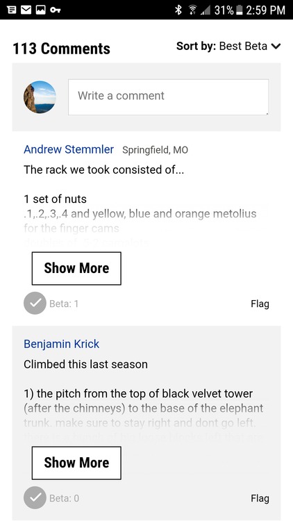 3. select Show More - more text appears  4. select Show More again - note last couple lines are still grayed out  5. select Show More again - note last couple lines are slightly less grayed out 
 |
|
|
bob jensen wrote: it looks like routes are saying they were shared when the area they are under were originally shared.. also thanks for the work. of course, going to miss the old layout at first but will forget about it shortly i'm sure.. |
|
|
Also - not a fan of the nearby routes table (e.g. 'Routes in Black Velvet Wall' shown below) being the first thing displayed on a route page on mobile: 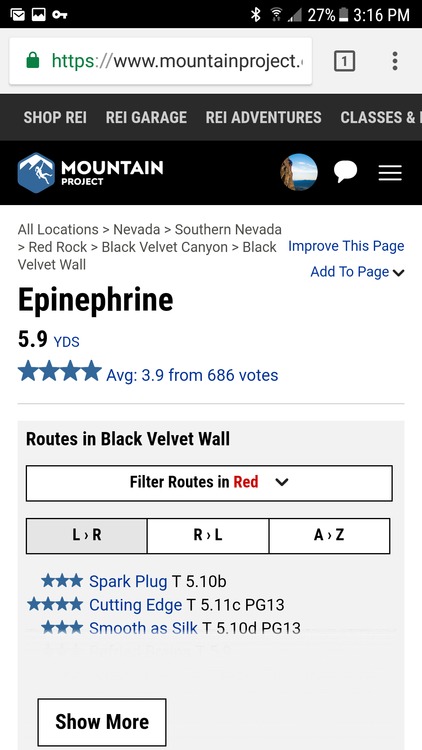 My preference would be to move that section down after route comments. It makes sense to keep near the top for route pages though. |


