|
|
Russ Walling
·
Nov 25, 2017
·
Flaky Foont, WI. Redacted…
· Joined Oct 2004
· Points: 1,216
|
|
|
John Hegyes
·
Nov 25, 2017
·
Las Vegas, NV
· Joined Feb 2002
· Points: 5,681
What's New in Favorites - Photos page does not give the location or the poster's name. Routes and Areas pages do not give the poster's name.
|
|
|
Nick Wilder
 ·
Nov 25, 2017
·
Boulder, CO
· Joined Jan 2005
· Points: 4,098
·
Nov 25, 2017
·
Boulder, CO
· Joined Jan 2005
· Points: 4,098
I've added more details to the breadcrumbs on the comments. For photos, you have to open it to see the location, which happens in a popup now so you don't lose your place. I'm not sure the poster's name is critical for this view of routes and areas.
|
|
|
John Hegyes
·
Nov 25, 2017
·
Las Vegas, NV
· Joined Feb 2002
· Points: 5,681
I'm sorry, Nick. I've been hesitant to jump on the complaint bandwagon. But readability has taken a major hit with these changes. Scrolling my eyes down the comments is very jarring, the new format is very difficult to read. Seeing the information in a columnar format was a lot easier to scan. And lacking the location information on the photos is a major oversight. One photo per line works a lot better than a grid with several photos on the same line.
|
|
|
John Hegyes
·
Nov 25, 2017
·
Las Vegas, NV
· Joined Feb 2002
· Points: 5,681
Maybe some bold face on the comments page would make certain details pop out a bit more - like the route or area being discussed.
|
|
|
John Hegyes
·
Nov 25, 2017
·
Las Vegas, NV
· Joined Feb 2002
· Points: 5,681
I should add I was viewing the website on a desktop - with a pretty wide screen. The pages do look better on my cell phone. But the photo page is missing any information under each photo.
|
|
|
BJ Sbarra
·
Nov 27, 2017
·
Carbondale, CO
· Joined Aug 2006
· Points: 671
I'll add that it's much harder to read the grayed out text of the areas/routes in "Comments" and "Routes" in What's New. Changing the font to black would go a long way toward making it easier to scroll through these. Also seems weird the grade is over on the other side of the star rating.
|
|
|
Charles Vernon
·
Nov 28, 2017
·
Colorado megalopolis
· Joined Jan 2001
· Points: 2,754
Agree with BJ. I've always liked to scroll through the new comments to see if anyone has posted anything relevant about a route or area I'm interested in. The new format makes that super annoying, it's like it's set up to look and see who has commented rather than what they've commented on. But I imagine most people, like myself, are more interested in the latter. The old format made it much easier to quickly scroll through for that.
|
|
|
J. Albers
·
Nov 28, 2017
·
Colorado
· Joined Jul 2008
· Points: 1,926
I would agree with the suggestions above. The fix you instituted to address Russ' original comment has helped a bunch, but I would suggest that it was better when you simply listed the whole shebang instead of having the breadcrumbs at all. Also, I would second the suggestion that black text would help (the gray text is definitely hard on the eyes). Thanks.
|
|
|
Paul Morrison
·
Nov 28, 2017
·
Unknown Hometown
· Joined Nov 2006
· Points: 55
I'm really annoyed by the greyed-out "Date" after each comment. I want to know how recent the post is before I even start to read it. I don't want to have to squint and search for this simple piece of information, that used to be prominent and easy to read in the left margin.
|
|
|
John Hegyes
·
Nov 29, 2017
·
Las Vegas, NV
· Joined Feb 2002
· Points: 5,681
With the favorites, it has devolved in to this for me... "What's new in photos?" ...Beats the heck out of me! What was once just a single click is now sometimes dozens. No thanks.
|
|
|
John Hegyes
·
Nov 30, 2017
·
Las Vegas, NV
· Joined Feb 2002
· Points: 5,681
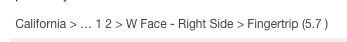
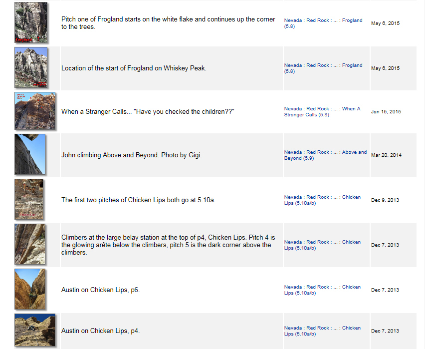
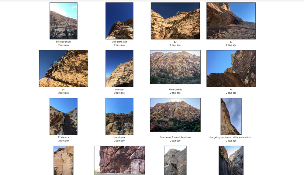
The MP database was built by many dedicated users that have spent countless hours inputting all of the climbing beta. I’ve been contributing in my small way for almost 15 years. I upload route information because it is a fun way to spend time for me. This represent a lot of work which I have no problem doing. However when changes are made that make the process excruciatingly more tedious, I have to speak up. To be a frequent contributor, do you have any idea how many times a day or a week, I click on “What’s New”?? The new format provides a lot less information and makes it much more time consuming to go through the new content. What might be more efficient coding, and a more portable format, is a lot less friendly to operate. I appreciate the time that people like Nick spend upgrading the website and keep it operating. But if he makes the site more difficult to navigate then he alienates the people that freely contribute to the database. Currently I am one unsatisfied constituent of MP. The first picture, taken from a user profile page, actually shows useful information that is easy to scan at a glance. The second pictures shows the updated “What’s New” photographs and the information is sorely lacking. Who has time to click through each and every photograph to determine its location? And finally, Nick said I'm not sure the poster's name is critical for this view of routes and areas.
Well, I see MP as not just a database but a social platform as well. It’s nice to see what people are up to. Also, eliminating the contributor name is insulting to the uploaders – it is becoming apparent that MP no longer cares about who built its content. There is so much white space in the new design – why not try to fill it in with the useful information that it once contained??
|
|
|
Nick Wilder
·
Nov 30, 2017
·
Boulder, CO
· Joined Jan 2005
· Points: 4,098
Hey John, thanks for the feedback. Hopefully you've noticed I respond quite frequently either explaining my reasoning or actually making changes. As you can imagine, there are many use-cases for MP. You represent an important one, but not the only one, and feedback from you and others helps me understand the various ways several MILLION people use our site each year. Even if I could understand all the important uses, I can't satisfy them all. Also, the old format was not responsive and cannot be exactly duplicated in the modern world. With over half of our traffic on mobile devices of various screen widths, all new pages have to be responsive, which is particularly hard with the wide tables that were common in the old pages. I'll be working on a follow-up round on the What's New page soon and will keep your feedback in mind - it's always welcome. Thanks again.
|
|
|
John Hegyes
·
Nov 30, 2017
·
Las Vegas, NV
· Joined Feb 2002
· Points: 5,681
Thank you. Sorry to belabor the point, I just want to fully express my position.
|
|
|
J. Albers
·
Nov 30, 2017
·
Colorado
· Joined Jul 2008
· Points: 1,926
John Hegyes wrote:The MP database was built by many dedicated users that have spent countless hours inputting all of the climbing beta. I’ve been contributing in my small way for almost 15 years. I upload route information because it is a fun way to spend time for me. This represent a lot of work which I have no problem doing. However when changes are made that make the process excruciatingly more tedious, I have to speak up. To be a frequent contributor, do you have any idea how many times a day or a week, I click on “What’s New”?? The new format provides a lot less information and makes it much more time consuming to go through the new content. What might be more efficient coding, and a more portable format, is a lot less friendly to operate. I appreciate the time that people like Nick spend upgrading the website and keep it operating. But if he makes the site more difficult to navigate then he alienates the people that freely contribute to the database. Currently I am one unsatisfied constituent of MP. The first picture, taken from a user profile page, actually shows useful information that is easy to scan at a glance. The second pictures shows the updated “What’s New” photographs and the information is sorely lacking. Who has time to click through each and every photograph to determine its location? Hi Nick, thanks for the response. And I hear you about the mobile part. That said, consider this. Mobile users are mostly just that: users (i.e., consumers). Those of us who are contributing are almost certainly doing so from an actual computer. So while mobile users are important on a bulk user number statistically basis, don't underestimate how important the minority computer access users are who actually add and maintain content. With that in mind, I am near complete agreement with John on this. Using the "What's New" feature is a super useful way for those of us who contribute to see (and help contribute to) the areas that we frequent or have a strong working knowledge of. The new format is terribly painful to scan. The way that it was previously formatted meant that you could scan through all of the comments, new routes, and pictures in a very efficient manner. For example, having all of the "state" "areas" etc. line up in one place as you scan downwards means that your eyes don't have to move side-to-side when scrolling downward. This may seem trivial, but it makes a huge difference. With the comments and pictures as they are now, you end up needing to do a LOT of clicking to accomplish the same goal. And it is very difficult to understand what the user gets in exchange for this added effort (aside from phone-people getting quicker load times...god forbid they have to wait more than a milli-second). In the end, I would guess that some people will almost certainly contribute less because it is so frustrating to navigate. And to mirror what John said, I understand and appreciate all the effort that Nick et al. put into this (their) website, but please don't forget that regardless of who maintains the site, it is the users who drive the content and make it usable, up-to-date, and widely used by the community, so please try and take our comments as constructive criticisms and make changes accordingly (after all, the commentators on this thread are hardly trolls, rather they are long-time users who have contributed a LOT of content). Thanks.
|
|
|
eli poss
·
Dec 3, 2017
·
Durango, CO
· Joined May 2014
· Points: 525
Bumping the thread. Nick, in case you haven't already gotten this feedback: I like how the new page allows you to easily sort by type (routes, areas, photos, comments). However, unless I'm missing something, there isn't a way to sort by date (within the past day, week, month, etc.) which makes it very difficult to keep track of what is actually new to you. If you could bring this function back I think the page would be perfect.
|
|
|
Nick Wilder
·
Dec 3, 2017
·
Boulder, CO
· Joined Jan 2005
· Points: 4,098
Thanks Eli, I will be working on this system again next week.
|
|
|
Rich Farnham
·
Dec 4, 2017
·
Nederland, CO
· Joined Aug 2002
· Points: 297
I'm looking at the new routes on my "what's new in favorites" page. Clicking on the "show more" link at the bottom of the page doesn't seem to work. When I click on it, I get a red circle with a line through it. Hoping that's a fixable bug. I like to keep up with new routes in my favorite areas, and need to go back a few pages if I haven't been on MP in a while, and (like today) people have uploaded a lot of new routes.
|
|
|
Nick Wilder
·
Dec 4, 2017
·
Boulder, CO
· Joined Jan 2005
· Points: 4,098
I've made some changes: - The user is shown directly on the page for all types (routes, areas, comments, photos)
- Photos now show the location breadcrumbs
- The time filters are back (1 Day, 1 Week, 1 Month)
- Many subtle cosmetics
|
|
|
eli poss
·
Dec 4, 2017
·
Durango, CO
· Joined May 2014
· Points: 525
Thanks Nick, much better now. The new UI and color changes are going to take a bit of getting used to but I think it is equal or better now, in terms of functionality. But there is just so much white space, it's kind of hard on the eyes sometimes.
|

 Continue with onX Maps
 Sign in with Facebook